A light filled kitchen remodel
Project scope: space planning
Home: 1981 split level
Positives of existing kitchen:
Generous amount of natural light through the home’s large picture windows
Problems with the existing kitchen:
Lacks accessible storage
Cabinetry plan creates three deep countertop corners that are not useful workspaces & deep base corner cabinets that are not ideal for storage
Pinch point at the passageway into the kitchen & refrigerator blocks completely when it is open
12” of working space to the right of the range
Bar counter depth does not meet code for seating
Client preferences & goals:
Keep plumbing in existing wall
Keep range in existing place
No changes to window or door placement
Keep existing kitchen footprint
Okay to remove 12” soffits that drop upper cabinets (no HVAC, plumbing or electrical reside there)
Create more accessible storage
More efficient use of space
Client likes spaces that feel casual, practical and connect her to outside
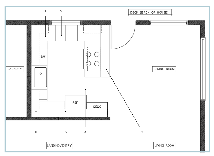
Existing G-shaped floor plan
Deep corners
Narrow base drawers
9” bar counter depth behind range
Pinch point into & out of kitchen
Cannot reach cabinet above refrigerator
12” soffit above all upper cabinets
Revised floor plan
Removing base cabinets below the window removes the cabinet returns, in turn providing forward facing storage and working counter space
Bar counter seating replaced with storage below the counter.
Peninsula extended 21” to create more working space on counter and space for an undercounter microwave
Pinch point resolved by removing run of base and upper cabinets, desk and relocating refrigerator
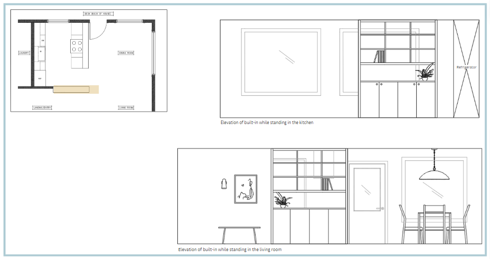
Replacing part of the wall with a tall built-in provides:
storage that does not conflict with the passageway in & out of the kitchen
brings visual interest to both kitchen & living room
connects the kitchen to the living room with open shelving while maintaining separation of space
Refrigerator upgraded to counter depth
Sink and dishwasher shifted 12” to the right to allow for landing to right of refrigerator
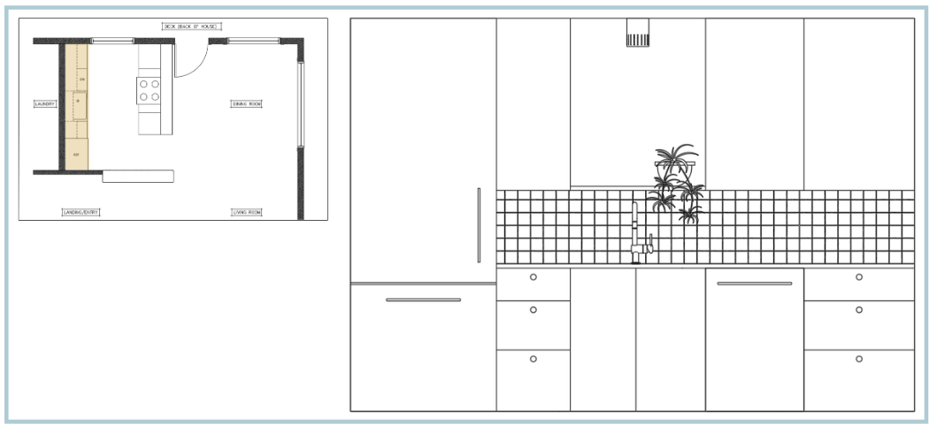
Sink elevation
Removing the soffit makes the space feel more open and allows for more storage capacity in the upper cabinets
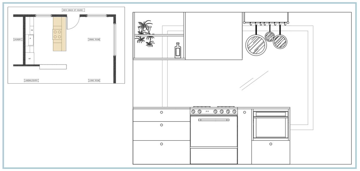
Range elevation
An open shelf and hanging pot rack bring more storage without feeling too heavy or blocking natural light
Built-in elevation
The built-in maintains a separation of space while the open shelving creates connection between the two spaces
Final thoughts:
Sometimes less is more. This kitchen felt cramped, which I credit to the G-shaped cabinet plan for this size of kitchen. Because the kitchen footprint would not be increasing and the plumbing wall and range are to remain in their locations, the cabinet layout needed to be reevaluated. Removing the two runs of base cabinets, and relocating the refrigerator helps the space breathe. It solves the passageway pinchpoint, allows for larger work zones at the range and to the right of the sink, and gives opportunity for wider base drawers. Corner cabinets allow you to continue a run, but they aren’t always they best use of creating accessible space. With the parameters in place, it did not feel like there was anything to gain by opening up the floorplan. While the client has a casual home, it’s nice having a space other than the kitchen as a first impression. It also gives the client flexibility to leave messes in the kitchen without highlighting them for everyone who comes over.


